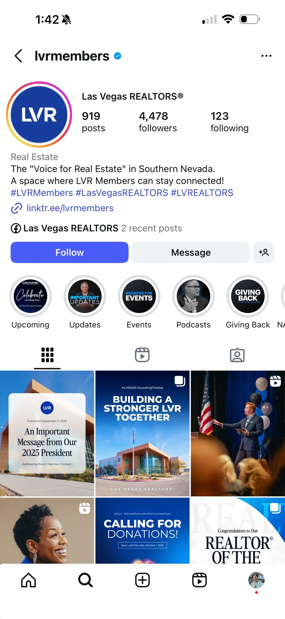
An Identity That Matches the Scale
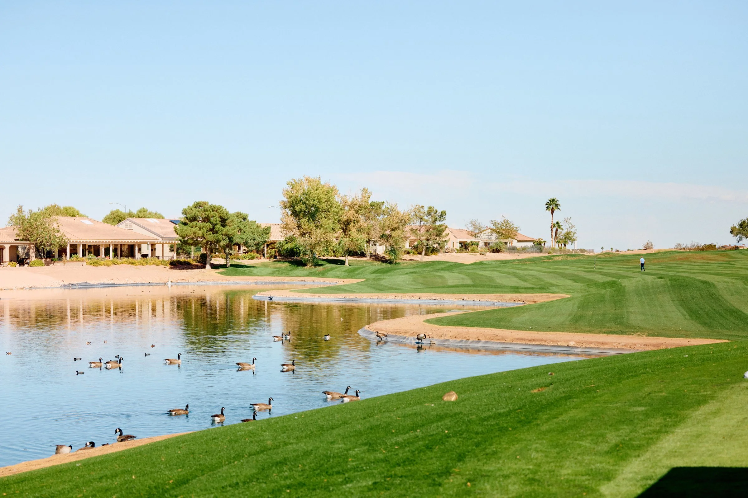
Las Vegas REALTORS® represents more than 15,000 members across Southern Nevada. The brand was a logo and three colors in a PDF. No system, no guidelines, no visual language. It had to hold at that scale, across every surface the association touches. It needed one idea to organize around: a REALTOR® is a neighbor first, working for homeownership, fair housing, and the community they live in. The brand's job was to make that idea legible and carry it everywhere the association shows up.

( → )Built as infrastructure, not decoration
A brand this size has to survive contact with reality. The people putting it in front of members work in education, membership, events, and accounting. Most of them are not designers, and the requests move fast. That ruled out the stylized directions of the moment. Fintech minimalism, 3D, heavy script — each would have impressed the design-literate few and lost everyone else. So the brand was built as infrastructure: a small, consistent set of patterns anyone could apply and still land on brand. Recognizable everywhere it has to work at once, in any hand that picks it up.
( → )A place to make the work
A brand standard only holds if there is a place to make the work. An in-house studio gave it one, built for filming, editing, and live production. More than a production room, it gave members somewhere to step into the brand and make content alongside the association instead of having a staff voice stand in for them. That is the point where the brand started to shift from something the association published to something its members took part in.


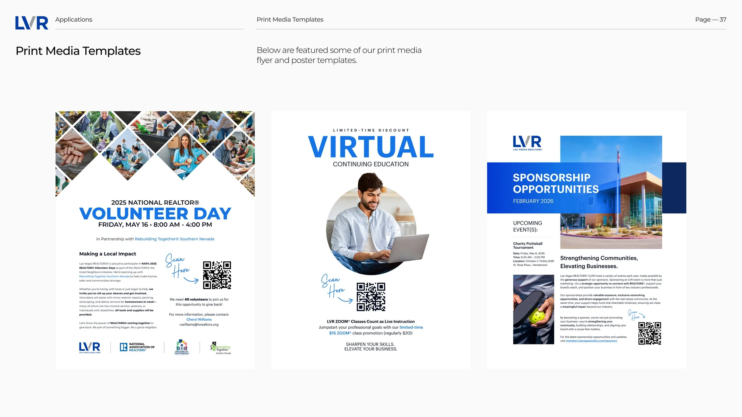
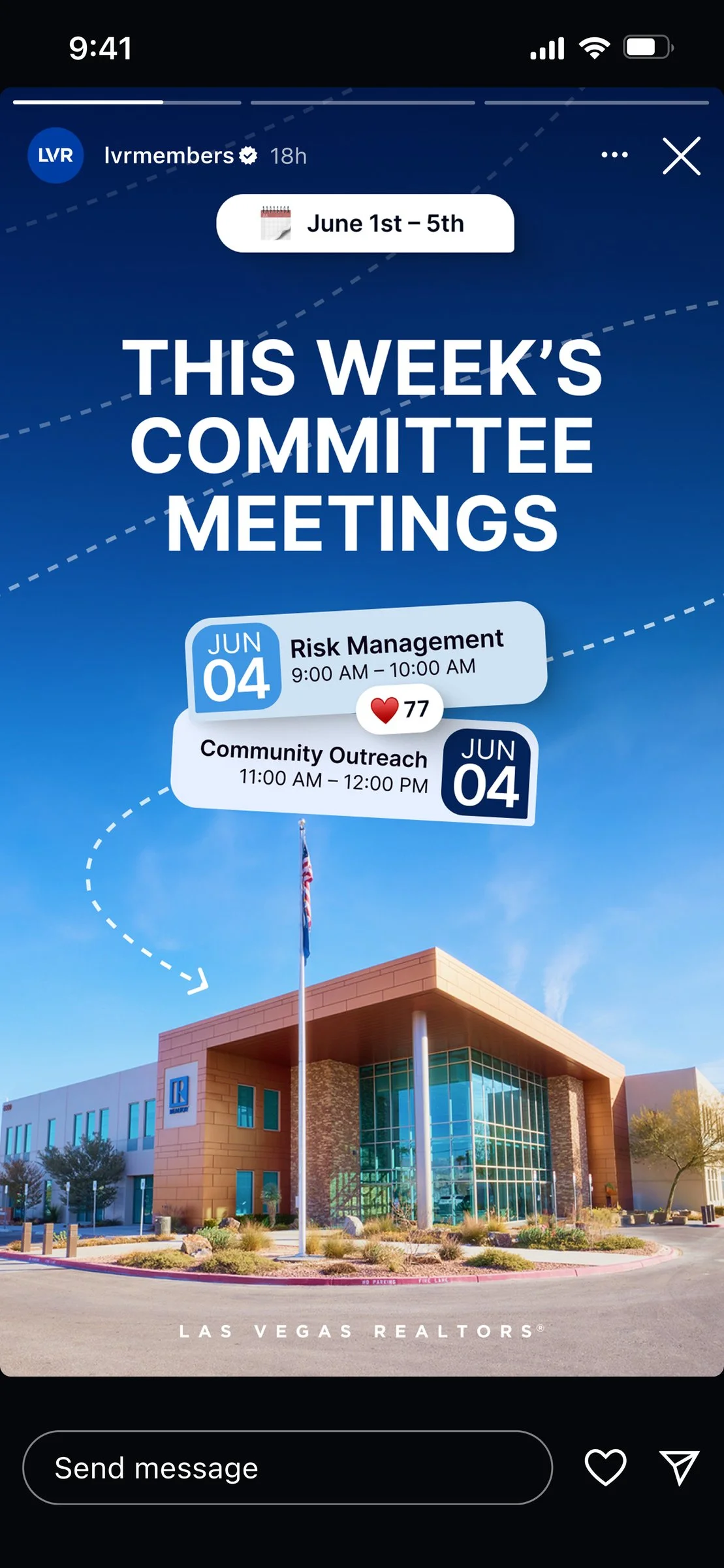
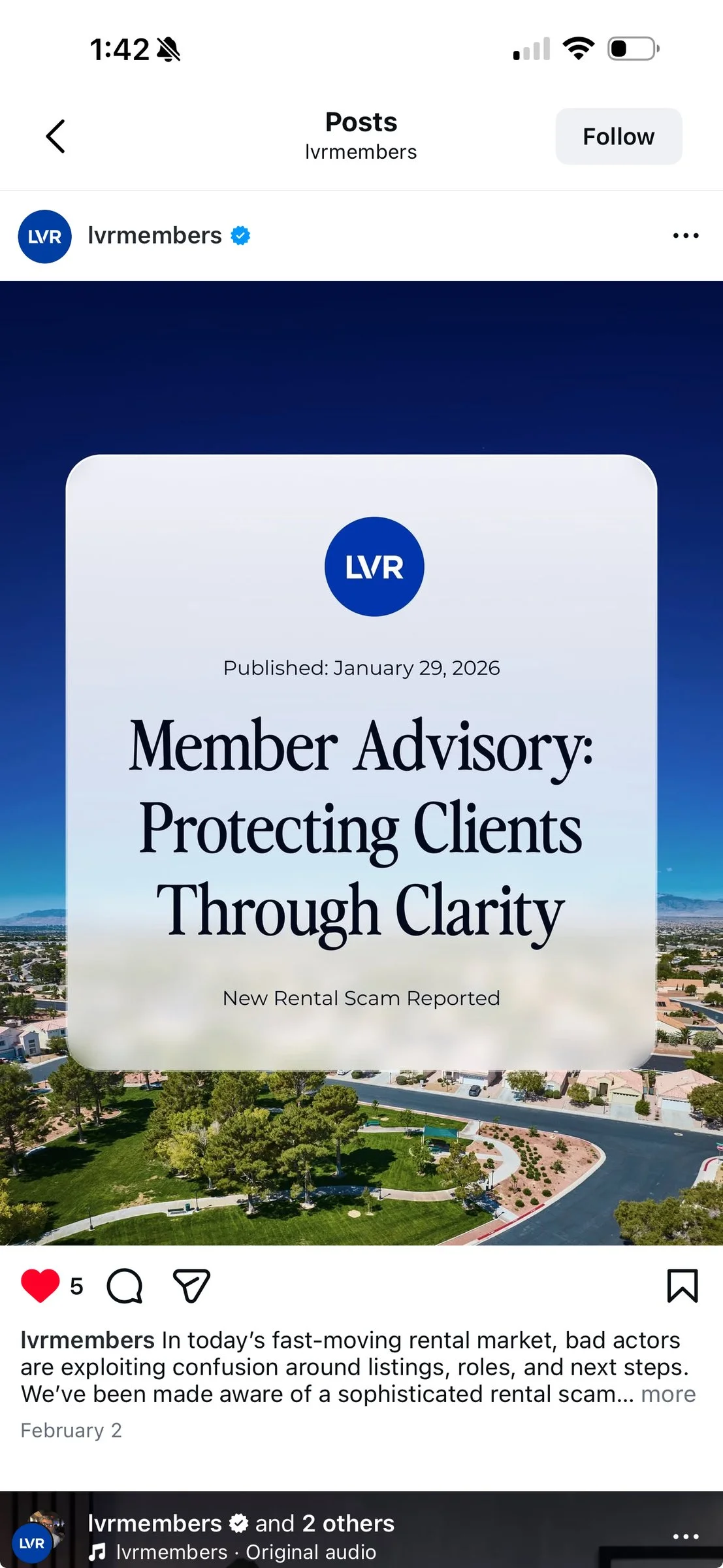
( → )One brand on every surface
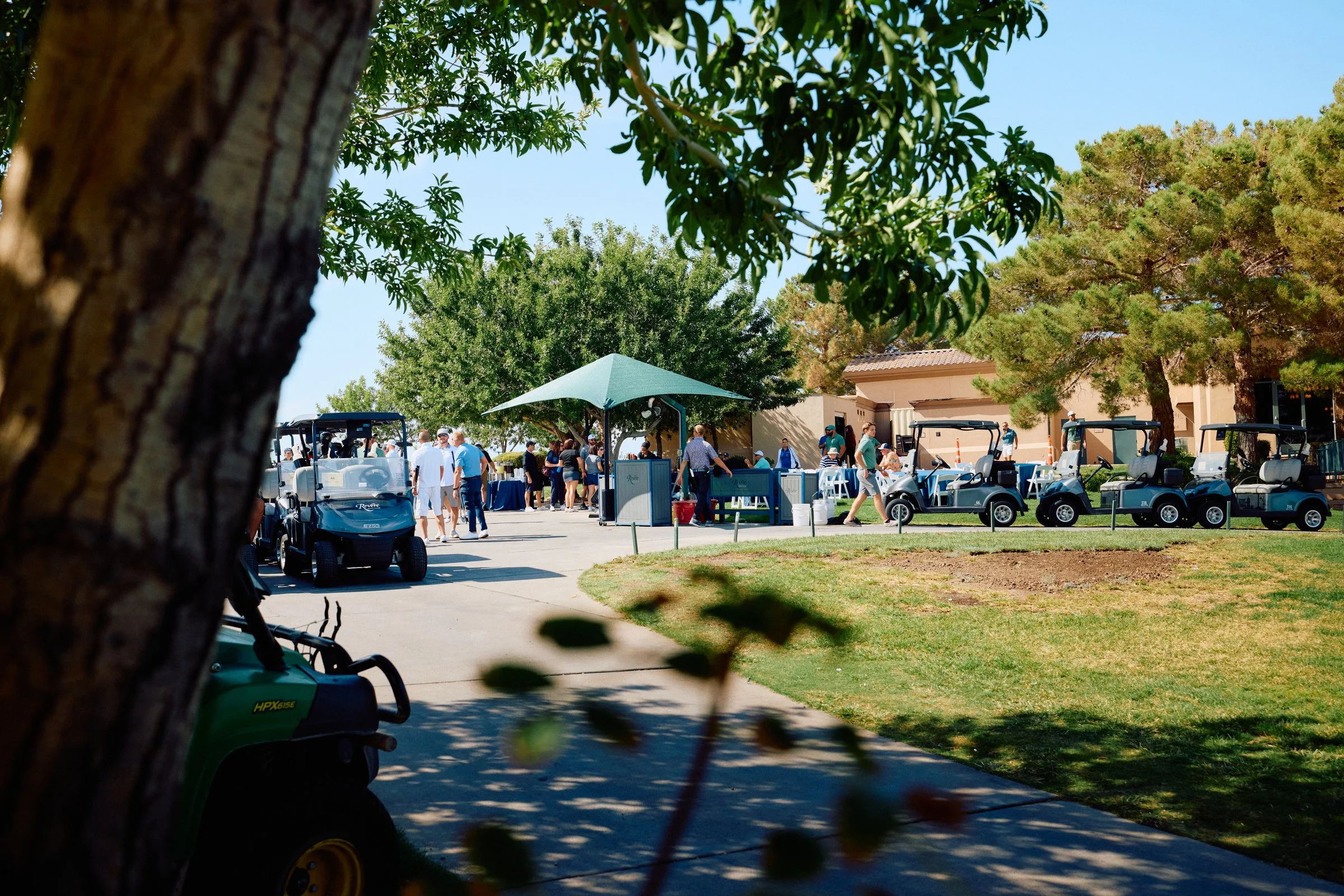
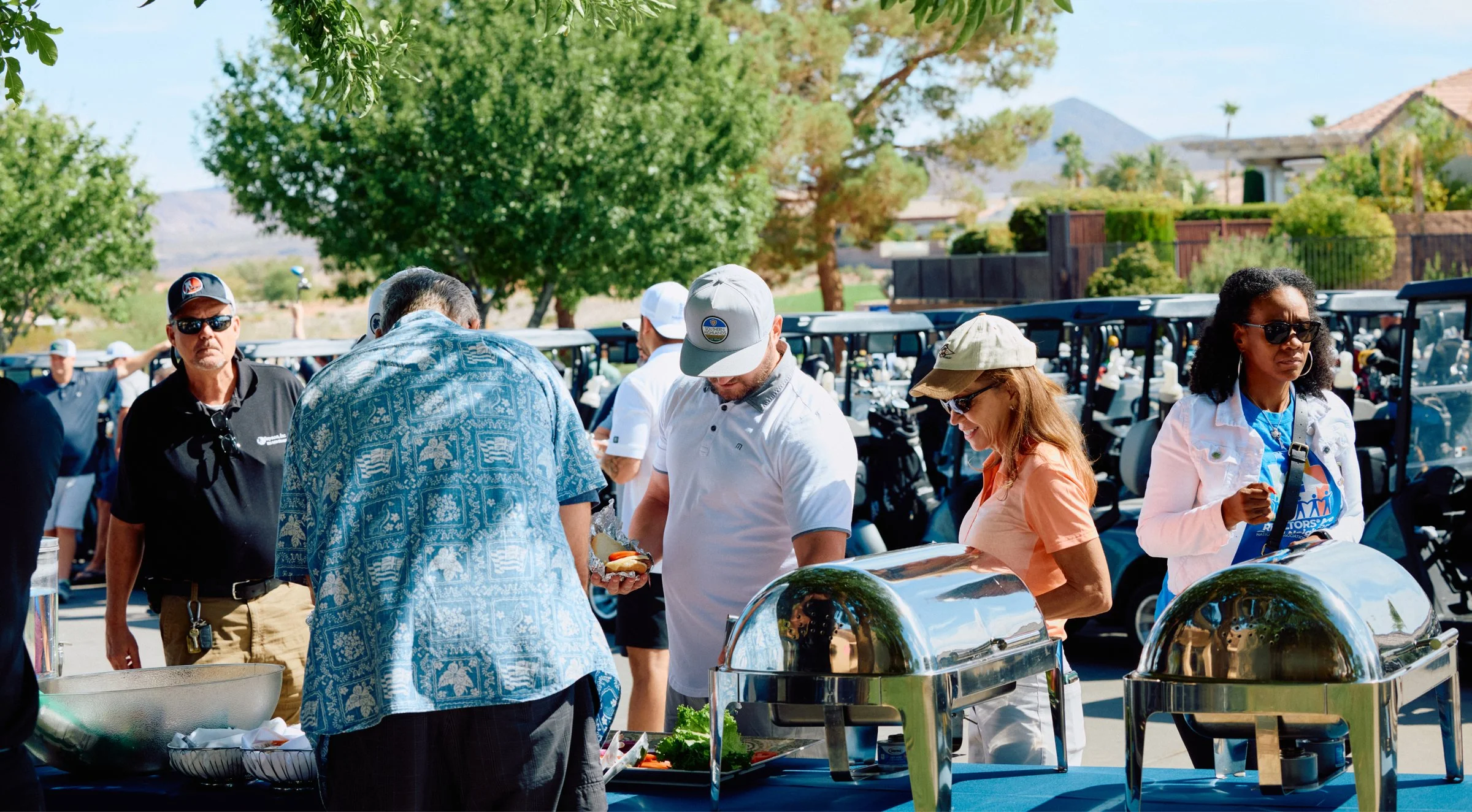
The real test of a system is how far it stretches without breaking. Print, screen, stage, and paper come out of the same small set of parts, so a member meets the same brand at a conference, in their feed, or in their hands. The breadth is the proof. A brand only counts if it holds up everywhere it shows up.
( → )The simplest system survives the most opinions
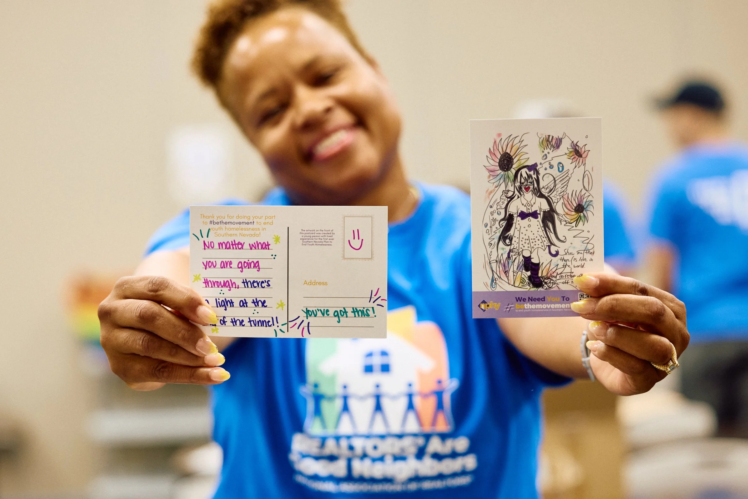
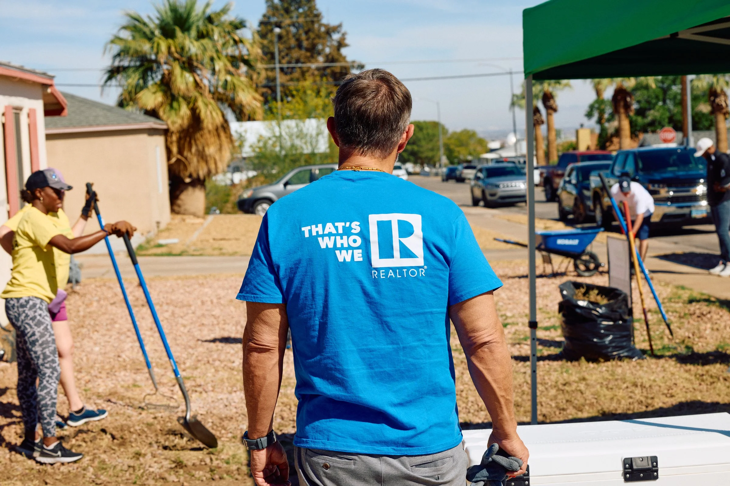
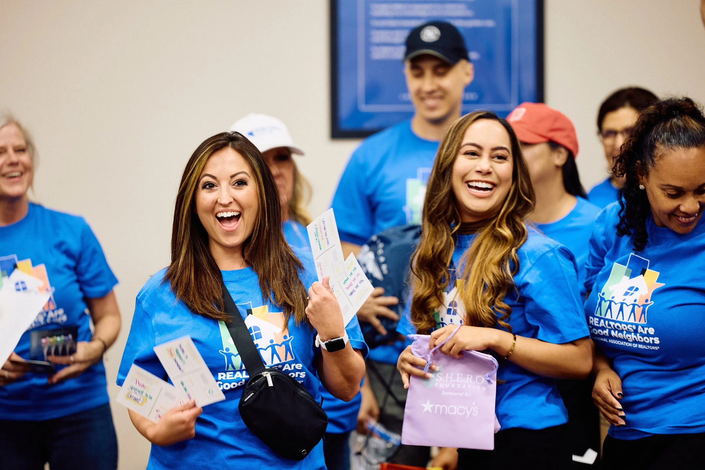
An organization this size will always have opinions about its brand. The system absorbs that pressure by putting members at the center instead of preferences. Real members at real events become the visual identity, and everyone sees themselves in it because it is them. Holding a brand this simple is harder than letting it grow complicated, and that is the work.
Metrics
15,000+
Members represented
$160K
In-house studio, 2024
60–65%
Email open rate
<100
Members fully unsubscribed, 4 years
Additional Credits
Austin Williamson
Creative Direction
Kurtis Murray
Photo / Video Production
Devin Sheffield
Videography
Sirena Ojeda
Social Media
Aleks Blagojevic
Graphic Design
Luis Suaréz
Development

